Super Responsive Layout Challenge
We're getting flexible over here!

At PE we’ve spent a lot of time making sure we have a solid understanding of the different display types in CSS. Over the last few weeks (we had a week long break in there somewhere) we put in a lot of focus on display: flex.
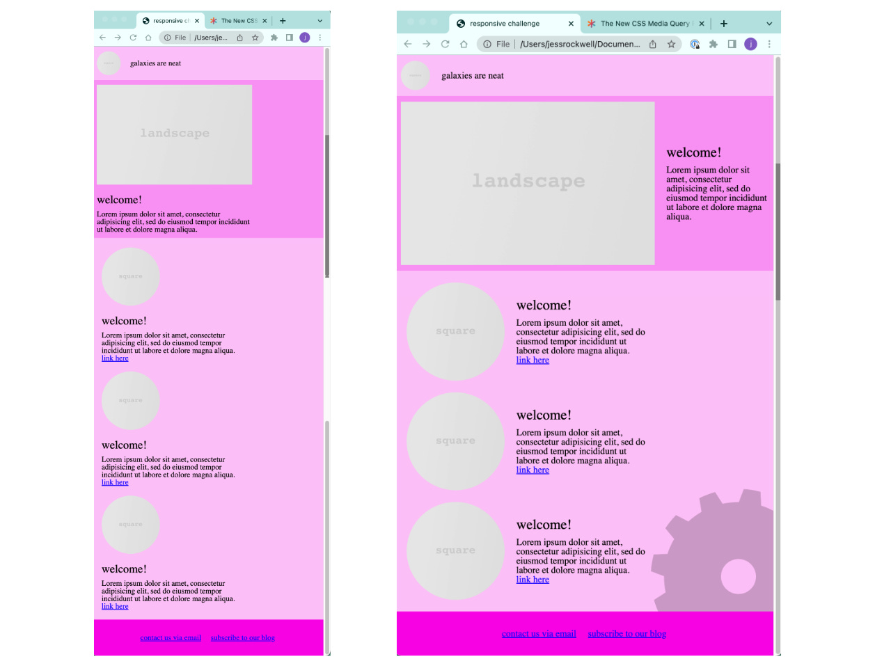
We tested our understanding of display:flex with attempting to replicate a mock website.
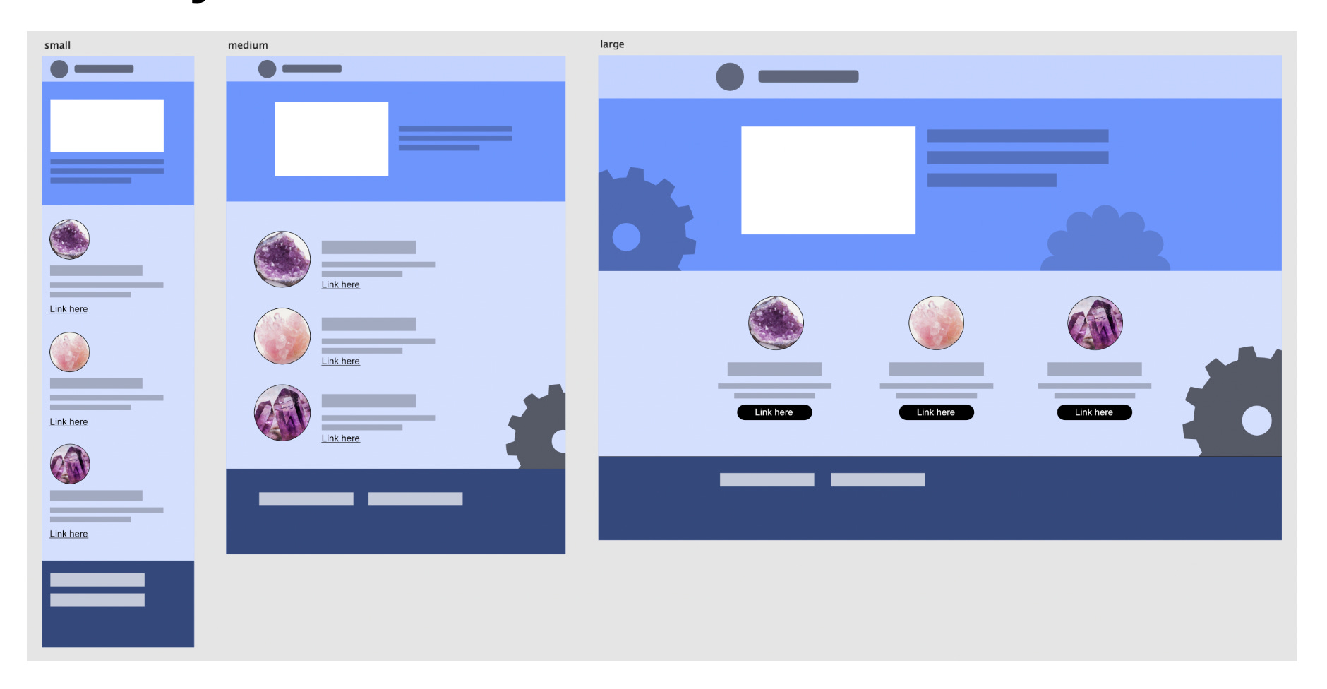
The exercises leading up to the big layout challenge went really well. I felt like I had a good understanding of what flexbox was and how it worked. I made a flexbox module in codepen with a few breakpoints. This exercise really helped me see the power of flexbox and solidified the parent/child relationship. Having a different color border on each box made it easy to see how styling the parent made child inside “flexible”.
Onto the big layout challenge …
Planning: This was my weak spot. I planned. I drew out the layout. I mocked it up. But that didn’t mean that I fully understood where to start.
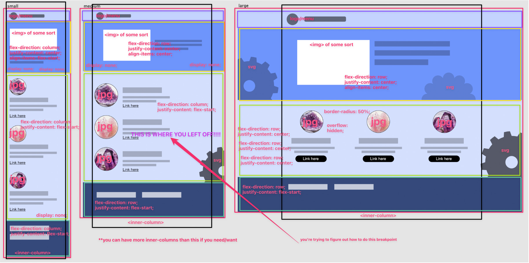
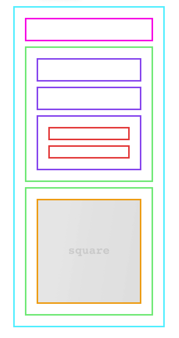
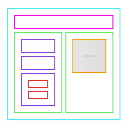
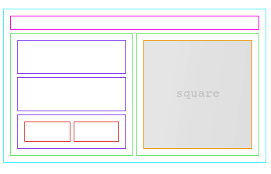
I jumped in without fully thinking through each screen-size and how I needed the boxes to move around. If I planned this out again I’d put a box around everything, because that’s what it all comes down to. Boxes. I’d also take the time to write down what I need to happen at each break point. I sort of did that, but it’s all half-way done. I didn’t think I was half-way doing my planning, but after having my first go at re-creating this my weak spot was illuminated.
I’m super lucky to not be alone in my learning process. There’s always someone online from alpha-six and we’re taught from day one the value in asking questions. I needed to ask for help, but didn’t know where to begin. Thankfully a classmate reached out to me with a “how’s it going for you over there?” and that got me going in the right direction. She reminded me to start with my smallest screen size first. That was a game-changer for me. I made some decent progress and things were working, but my code felt disconnected and disorganizd.
The next day I was struggling with the medium-sized screen. I decided to ask for some more help from the class. I got a helpful reminder that everything is a box inside of a box. I made some more progress, but still struggling. Derek and I jumped on a call and we walked through the project in a codepen. This was exactly what I needed. He reminded me to use the things that I already have a solid understanding of and that we’re layering in new things on top of the things we already know.
I decided to start from scratch. I had poorly named my classes and custom elements and was confusing myself. I know this is something that will get better with practice.
Starting over: I felt much better and it went really quickly.
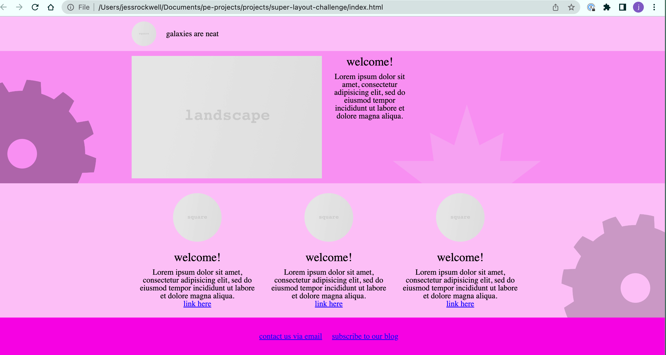
Second attempt reflection:
I used much better names for my classes and custom elements. Derek says the idea is to not have to look back at your HTML as your writing your CSS, because you named things well. This is hard!! But it’s getting easier now that I’m creating my own little vocabulary for these things.
Modules: When planning take note of where things repeat. Make a module.
Borders: I used borders a lot to keep track of what things were inside of what box. Putting a border on an element was a very fast way to identify why something wasn’t working. I caught myself not using the <picture> element around an <img> by doing this.
The footer: I was struggling getting my footer to stay at the bottom of the page. The adjustment was making sure the <body> min-height was 100vh.
CSS positioning: Remembering when using absolute positioning that it attaches to the nearest parent element that is position relative.
This is all a big puzzle and saying out loud what I need to happen is a fast way to get to where I need to be.
Typography: though not the point of this challenge, it’s something I’ve got to put more focus on.
There was a second challenge available if we wanted more practice which went really well. More to come on that later …
{{insert Mr. Burns "excellent"}} Gif. Everything is going as planned... muahahahaha
From Alpha 3 here - keep asking questions! It will ALWAYS be helpful. It's awesome that you've got a fellow student checking in with you too. Keep that up and you all will do great!
"I jumped in without fully thinking through each screen-size and how I needed the boxes to move around. If I planned this out again I’d put a box around everything, because that’s what it all comes down to. Boxes." -- This was a good breakthrough also! I definitely found myself guilty of this too, and the planning REALLY is essential!